20/09/2024

20/09/2024

The graphic design for the 2024 Tallinn Applied Art Triennial titled The Fine Lines of Constructiveness was created by Laura Pappa and highlights the courage and joy of experimentation.

“For me, the theme of the Triennial evoked the beginning stages of any creative process, which from a designer’s point of view is often the most exciting stage,” said Laura Pappa about her inspirations. “I associate the title of the exhibition – the fine lines of constructiveness – with keywords like experimentation, temporal, volatile, seeking, experimentation. Above all, I wanted the design to have an experimental and dynamic character.”

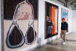
The design elements feature collages of the artworks displayed at the exhibition, foregrounding the diversity of materials, techniques and approaches in contemporary craft.

“The selection of artworks is exciting and eclectic, which is why I was curious to create a symbiosis of different works and shapes,” added Pappa.

Laura Pappa is a graphic designer based in Amsterdam. She has studied at the Estonian Academy of Arts, the Gerrit Rietveld Academy in Amsterdam and Werkplaats Typografie in Arnhem.

Anu Almik


09/07/2021

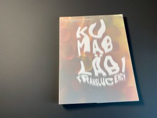
The catalogue of the 8th Tallinn Applied Art Triennial is now available HERE.
The catalogue is introduced by the curator of the exhibition Stine Bidstrup, discussing the central concept of the show, translucency, followed by an overview of all the participating artists as well as high quality photos of the artworks. Additionally, the publication features a detailed list of all the works included in the exhibition.

The catalogue concludes with two essays. In her essay “Moments of aliveness”, the architecture and art historian and curator Ingrid Ruudi contemplates the artworks presented at the exhibition and our encounters with material as possibilities to experience unique moments of aliveness.

„To encounter works, objects and materials that are ambivalent, unstable, fragile and temporary means noticing the ambivalence, multiplicity, impermanence and contingency of my own being in the world. But this is not a source of fear and insecurity but enables a heightenened awareness of being in the moment and contact with the other. Letting go of expectations of stability and permanence may lead to rediscovering enchantment and joy. Perceiving myself as flawed, partial and temporary paves way for encountering the human and non-human other from a less hierarchical, more equal basis.“ (from Ingrid Ruudi’s essay)

The essay by the architecture historian at the Royal Danish Academy, Martin Søberg titled “Saturated with light. On architecture and translucent materials“ looks at translucency in the history of architecture. The essay includes numerous photographs.

„The materials of architecture are put together, they carry and are carried, and furthermore become atmosphere-creating, enclosing membranes that allow adjustment and exchange. The phenomenon of translucency is then still about ambiguity, blurring and diffusion, but also about the potential for something new to emerge from the saturated light..“ (from Martin Søberg’s essay)

The catalogue is published both in Estonian and in English. The publication was edited by Keiu Krikmann and designed by Tuumik Stuudio.

The catalogue is sold at 25€, plus shipping costs. To place your order, please contact info@trtr.ee.


Anu Almik


06/03/2021

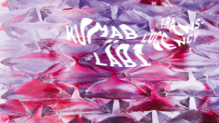
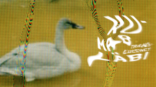
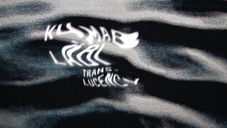
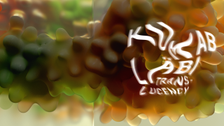
The graphic design for the 8th Tallinn Applied Art Triennial was created by Marje and Martin Eelma from the design studio Tuumik Stuudio. Their design blurs the boundaries between materials and environments and features fragments of exhibited artworks.

What were some of your first associations with the theme of the triennial, translucency?
Layers, steam, water. Diving into other materials. Or perhaps even parallel worlds that haunt you after reading a book or watching a film, worlds that are inside or layered on top of one another or as a grid. In order to evoke translucency you need more than one environment and these environments need to come into contact with one another, yet still remain separate. When they blend, translucency is lost.

What did you start the design process with?
The exhibition concept of the curator Stine Bidstrup and our initial conversations with the exhibition designer Kärt Maran led us to think about water as material and a surface of reflection. These ideas became the basis for the design. We also thought about the location of the exhibition, Kai Art Center just by the sea, and this, too, contributed to the further development of these ideas. Water is transparent matter, completely different from air. In places where water and air meet, light makes possible situations, where water is both transparent and reflects back into our world. Water can be quite dynamic, which results in dynamic images. Water or other liquids can also have a hue to them yet still be transparent to great depths.

The design also uses photos of artworks we will see at the exhibition.
We included artworks in the conversations about the design early in the process and that remained an important element, so we had to make these layers complement one another. On the one hand, a fluid and reflective surface layer that was expressed as a fluid and steamy typeface and beneath that, selected works or details of artworks. To conclude, the design was created in collaboration with the triennial’s team – we were discussing several directions that were more or less focused on the same theme but using various graphic elements. Finally, the design that expressed a common understanding of the theme the clearest was chosen. Reflections of water are not so clearly visible anymore, however, the steamy translucent typeface still evokes undulating water.

Could you talk about how you chose the four photos featured in the design?
First, we looked if the photos fit with our chosen typeface, the steamy and fluid typography had to be visible against the background. Not all photos supported that. In the end, we chose photos that worked best with the typeface.

The graphic design of the triennial features the following artworks: Wang & Söderström “Flatscreen“, Sandra Vaka “Jugs (bitter lemon)“, Eeva Käsper “Enclosed Secret” and Grethe Sørensen “Lillebælt III“.

Anu Almik


07/10/2020

The curator Stine Bidstrup has selected artists for the main exhibition of the 8th Tallinn Applied Art Triennial. 24 artists from the Nordic countries, the USA, the UK, the Netherlands, Estonia and Lithuania will be addressing the phenomenon of translucency, the main theme of the 8th Triennial. The selection includes seven Estonian artists.

Danish glass artist, art historian and educator Stine Bidstrup says the selected artists and designers represent some of the best practitioners within their fields with work characterized by strong conceptual exploration, playfulness and willingness to experiment. “The Triennial will showcase new and recent works that are created and exist across intersections between fine art, craft and design making these distinctions less important,” added the curator Stine Bidstrup.

“The curatorial theme of translucency is exemplified in a myriad ways through the work of the artists; translucency as a phenomenon, as an intermediate space inhabiting the space between the polar opposites of transparency and opacity, translucency in the use of language, in politics, creating ambiguity and complexity,” described Bidstrup her approach.

The exhibition will feature various fields, techniques and materials: glass, ceramics, clay, textile, garments, photography, sculpture, installation, jewellery, weaving, video, furniture, 3D-printing and digital design.

The Triennial’s main exhibition features the following artists from Estonia: Linda Aasaru, Eeva Käsper, Sandra Kosorotova, Julia Maria Künnap, Eve Margus-Villems, Helena Tuudelepp and Hanna-Maria Vanaküla.

Other participating artists include (in alphabetical order): Andrew Bearnot (USA), Phoebe Cummings (UK), Erin Dickson (UK), Ditte Hammerstrøm (Denmark), Heidi Bach Hentze (Denmark), Helen Lee (USA), Jiyong Lee (USA), Shari Mendelson (USA), Reinoud Oudshoorn (Netherlands), Julija Pociute (Lithuania), Anne Vibeke Mou (Denmark/UK), Sandra Vaka (Norway), Sissi Westerberg (Sweden), Karlyn Sutherland (UK), Grethe Sørensen (Denmark) and Wang & Söderström (Sweden/Denmark).

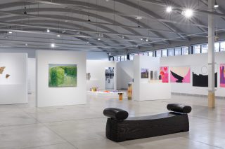
The main exhibition of the 8th Tallinn Applied Art Triennial “Translucency” opens at Kai Art Center in Port Noblessner in Tallinn (Estonia) on 28 May 2021 and welcomes visitors until 15 August 2021.

Tallinn Applied Art Triennial is an international art event established in 1997, organised by NGO Tallinn Applied Art Triennial Society. The Triennial contributes to the development of fields of applied art and contemporary craft.

Anu Almik


18/06/2020

The next Tallinn Applied Art Triennial will be curated by Stine Bidstrup, a Danish glass artist and art historian, whose curatorial concept focuses on the phenomenon of translucency both in contemporary craft and in a broader social context. The 8th Tallinn Applied Art Triennial opens at Kai Art Center on 28 May 2021.

The main exhibition of the triennial titled “Translucency” is built around Stine Bidstrup’s curatorial concept and features around twenty artists. A quarter of the participating artists will be selected among Estonian artists during curatorial visits to Estonia in summer 2020.

Merle Kasonen, the chairwoman of the triennial, highlighted the curatorial concept’s resonance in various fields of applied art as well as its broader implications in the contemporary world. “As Stine pointed out, depending on the context, translucency can reveal what is hidden or conceal what is seemingly visible,” added Merle Kasonen.

For example, the curator expanded on how wide use and promotion of glass (and transparency) indicates power and economic surplus, but when transparency is proclaimed as a sign of openness in architecture or politics or elsewhere, it is more often than not a sign of opacity, of not being able to see what is really going on. Looking in and looking out do not take place on equal grounds – transparency on the surface can, in fact, hide hermetic power structures and hierarchies. However, opacity, too, can be of value and at times, truly necessary,” explains Stine Bidstrup, whose curatorial concept centres what is in-between the two extremities – translucency.

Stine Bidstrup is a Danish glass artist, educator and art historian whose work and research explores optical phenomena, and interprets and brings ideas about utopian, architectural visions to life through glass sculptures, installation and video. Her curiosity revolves around the power of perception and power of context and point of view in constructing our understanding through vision and how the human eye and mind are always engaged in myriad determinations and negotiations.

Bidstrup holds art degrees from The Rhode Island School of Design and The Royal Danish Academy of Art School of Design and a degree in art history from The University of Copenhagen. She has taught in Denmark and internationally. She maintains a studio in Copenhagen, goes to Småland Sweden to blow glass, and is represented by Heller Gallery in New York and FUMI Gallery in London.

The 8th Tallinn Applied Art Triennial opens at Kai Art Center in Port Noblessner on 28 May 2021 and will remain open to visitors until 15 August 2021.

Tallinn Applied Art Triennial is an international art event established in 1997, organised by NGO Tallinn Applied Art Triennial Society. The triennial contributes to the development of fields of applied art and contemporary craft.

Anu Almik


20/04/2017

The main exhibition of the 7th Tallinn Applied Art Triennial will be opened in the Estonian Museum of Applied Art and Design this Friday, 21 April. The opening weekend of the triennial will include guided tours at the main exhibition, but also artist talks. Prior to the opening of the main exhibition everyone is invited to take part in the seminar and extensive satellite programme.

The thematic main exhibition of the 7th Tallinn Applied Art Triennial features artists from Nordic countries, Central Europe, United Kingdom, Ireland, Spain, Israel, but also China, Taiwan, USA and Canada. Their artworks reflecting on the concept of time were chosen to the exhibition out of 256 works submitted to the open call. The exhibition includes ceramics, jewellery, glass, textile and blacksmithing, but also video and large-scale installations.

It is also possible to visit the main exhibition in the Estonian Applied Art and Design Museum (Lai 17) with a tour guide. The first guided tours will take place on Saturday, 22 April at 11.00 (in Estonian) and at 16.00 (in English) and on Sunday, 23 April (in Russian). To participate in the guided tour museum ticket is required; the duration of the tour is approximately an hour.

On Saturday, 22 April everyone is welcome to meet the artists taking part of the main exhibition. From 12.00–15.00 the artists will be giving presentations at the Loewenschede tower (Kooli 7).

In addition to the main exhibition the triennial features an extensive satellite programme. This week alone will include 10 solo and group exhibition openings, as well as sound and participatory installations, a glass art project taking place in various cafés in Tallinn, a seminar on art mediation and many other events. To get more information on the opening weekend programme, see here.

Anu Almik


20/03/2017

The full programme of the 7th Tallinn Applied Art Triennial is now made public. In addition to the main exhibition, it includes a seminar on communicating applied art, an extensive satellite programme, artists’ talks and guided tours.

The main exhibition of the triennial, titled “Ajavahe. Time Difference” opens on 21 April at the Estonian Museum of Applied Art and Design and will remain open until 23 July. The exhibition includes 49 works by artists from 19 countries. These works were chosen out of 256 open call submissions by an international jury. The selection features ceramics, jewellery, glass, textile, blacksmithing, but also video and large-scale installations.

The opening day of the triennial, 21 April will start with a seminar dedicated to discussing communication in the field of applied art, taking place in Cinema Sõprus. The registration for the seminar is now open. The audience is also welcome to join our artists’ presentations event and guided tours.

The satellite programme consists of 26 exhibitions, performances and installations that take place in galleries, cafés, open studios and other exciting locations all over Tallinn. The satellite programme launches already in the end of March and will run until the beginning of August.

The goal of the 7th Tallinn Applied Art Triennial is to contribute to the development of concept-based applied art and design and introduce it to a broader audience.

Anu Almik


07/10/2016
One of the favourite visuals of Marje and Martin

The visual identity of the 7th Tallinn Applied Art Triennial is created by Marje and Martin Eelma from the graphic design studio Tuumik. We asked them a few questions about how the triennial’s visuals were developed. And they also share a couple of their own favourites.

The visuals for the Tallinn Applied Art Triennial is really colourful and eye-catching. How did you arrive to that? Is there a story behind it? What were you inspired by?

We started off with the theme of the triennial, “Ajavahe. Time Difference”. When we got the initial brief, it featured a description of the Italian jewellery artist Giovanni Corvaja’ painstaking years long work “Golden Fleece” that seemed to defy all (contemporary) rational thinking – he is creating fur-like ritual objects of gold. The objects are made of gold wire with a diameter of 1/5 of a single stand of human hair and they feel soft as fur. This took our breath away and made us think how different the concept of time can be for people. The theme of the triennial also spoke to us, time is something we think about often. Images from our own past also started popping up: Marje studied in Tartu and had to go back and forth between Tallinn and Tartu, either by train or bus, so she always wondered about the many lit windows she passed in the complete darkness 90 km/h and the stories they could have told.

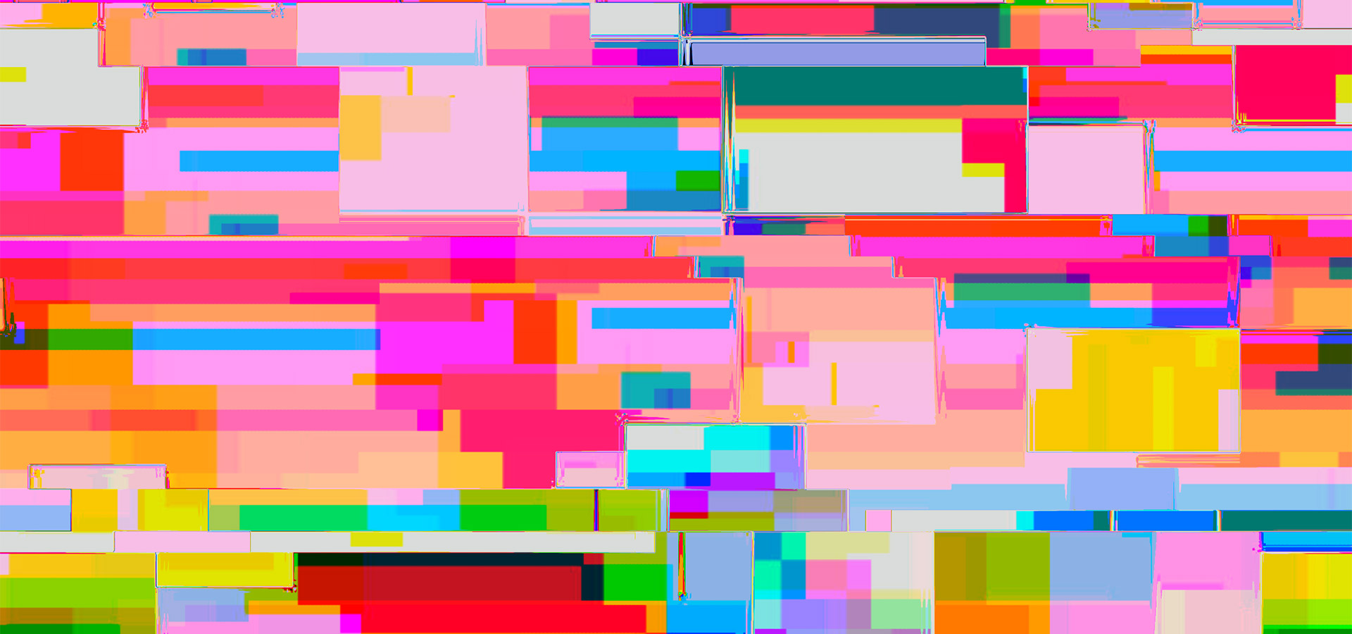
When we were creating the visual identity, we thought about the passing of time, how we perceive things differently, to what extent it is possible to go deeper when the tempo alternates – you notice bigger things when you move faster, details when you go slower. If the tempo is set for you by someone else and it is not what you are comfortable with, a certain shift occurs – you see your surroundings, but it seems different, your perception of reality is warped. Your own state of being changes how you see the world.

At first we were playing around with colourful surfaces, divided them into bigger and smaller sections, trying to convey different speeds with surfaces of different colour and size, according to the amount of information they displayed. Then we moved on to using a programme that worked in a way that you could shake, rotate or move around your tablet without even knowing what happens with the colours and shapes on the screen. The colours and shapes began shifting, the programme shook up reality and a whole other world appeared. We liked that it really related to the theme of pace, the passing of time.

Tuumik is a recognised graphic design studio, so you can surely choose your own clients. What inspired you to work with the triennial?

For us the number one concern is the people we work with, but also the project itself – is it necessary, does it have an idea behind it? It has to be consistent with our own view of the world. And the concept is also really important for us when creating the visuals. We also take on clients from outside the field of culture, although this field is particularly close to our hearts. It is important that we would find the work exciting.

We do not want to take on too many similar projects, it would not be interesting to us. We try to find projects that are new to us and we have not done art events like the triennial before. We were attracted to the fact that it is an international event. The participants seem fascinating and by working with them we can definitely get a more thorough picture than just by going to exhibitions. We love it when we get to know new things while working on something.

One of the favourite visuals of Marje and Martin


Anu Almik